A signup pop-up that converts without annoying people appears after a few seconds and stays away from the steps close to purchase, has a mobile version, offers something concrete and asks for one thing at a time: first a click, then the email, then the phone number, which people can skip. We'll show it with the numbers of a footwear store we work with: in 30 days its four-step pop-up was seen by 38,866 people and collected 2,306 emails and 1,455 WhatsApp numbers. Below you'll find how it's built, when to show it, what to ask for and how to read the stats.
How do I create a newsletter signup pop-up that converts without annoying visitors?
With five choices, in this order:
- The right form for the page. A pop-up where visitors are browsing, discreet forms where they're reading or deciding.
- The right moment. A few seconds after arrival, never in the cart or to people already subscribed, with a pause after someone closes it.
- Two versions, one for desktop and one for mobile.
- A clear offer that people get in one line.
- One request at a time: a yes, then the email, then the phone number with its own consent, if you want it.
Then you read the data step by step.
The case: a four-step pop-up
The store sells women's shoes in Italy, on Shopify with Klaviyo. These are the pop-up settings:
| Setting | The store's choice |
|---|---|
| When it appears | After 8 seconds, on desktop and mobile |
| Where | Every page except the cart and the pre-purchase help page |
| To whom | Only visitors not yet identified, never people already subscribed |
| After it's closed | Shows again after 2 days; meanwhile a tab stays visible: "A gift for you" |
| Design | Side image on desktop, text only on mobile |
| Step 1 | "Want to get a gift?": two buttons, yes and no, no fields |
| Step 2 | Name and email, with a line about consent |
| Step 3 | WhatsApp number, full consent text, a link to skip |
| Step 4 | A €15 code for the first purchase and a button to the new collection |
Here's how many people reach each step:
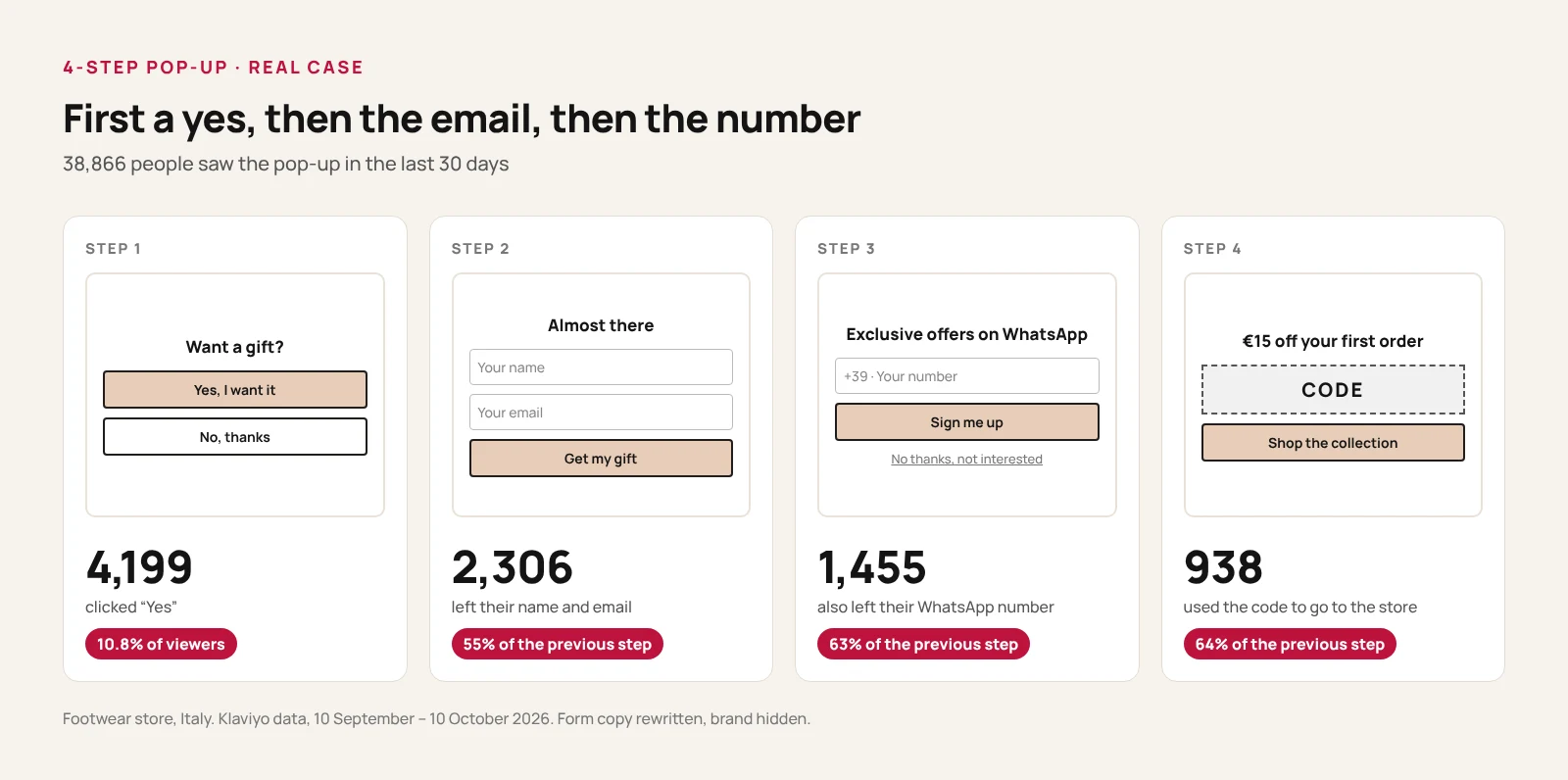
89% of visitors close the pop-up: in the last 90 days, 35,894 people out of 40,483 closed it. That's normal. The pop-up works on the minority who say yes. Over 90 days the signup rate is 5.98%, almost the same as the 5.93% of the last 30 days: the result is stable, not a lucky month.
Pop-up, flyout, banner or embedded form: where to use each
A pop-up interrupts browsing. It makes sense where visitors are figuring out what the store sells, less where they're comparing sizes, prices and returns.
| Form type | What it is | Where to use it | What to watch out for |
|---|---|---|---|
| Pop-up | A window in the middle of the screen | Homepage, category pages, pages with new traffic | The most visible and the most intrusive: on mobile it has to stay compact |
| Flyout | A box that slides in from the side | Product pages, blog posts | Lets people read the page, but gets noticed less |
| Banner | A bar at the top or bottom | The whole site, especially on mobile and during promotions | A click can open another form |
| Embedded | A form inside the page | Footer, signup page, end of blog posts | Collects less, but it's always there and never gets in the way |
Klaviyo describes the pop-up as the format that converts best and the embedded form as the least intrusive. A practical rule: pop-up for the entrance, flyout where people read, embedded form everywhere.
When to show it
Not in the first few seconds
Someone who just arrived is still working out where they are and is often closing the cookie banner. A pop-up that shows up right away gets closed on reflex. The store in our case waits 8 seconds. On long pages you can use scroll depth instead of time. You find the right value with a test on your own traffic.
Exclusions
- Cart and checkout. Don't interrupt people who are buying. The store in our case also excludes the pre-purchase help page, where people with a doubt are looking for an answer.
- People already subscribed. Seeing "subscribe" again after subscribing makes the store look like it doesn't recognize you.
- People who just closed it. The store shows it again after 2 days. Klaviyo's example settings for a welcome pop-up go up to 90: if your customers come back often, that means they'll almost never see it again. Choose based on how often your visitors return.
The teaser
After the pop-up is closed, a small tab stays on screen, "A gift for you", which reopens the pop-up with one click until the person subscribes. With 89% of visitors closing the pop-up, it wins back people who closed it in a hurry and change their mind after a few products. Keep it small and away from the buy buttons.
Google and mobile pop-ups
Since January 10, 2017, Google has said that pages whose content isn't easily accessible to people coming from mobile search may rank lower. Among the examples it cites a pop-up that covers the main content, either as soon as the page opens or while the user scrolls. Legally required notices, such as cookie consent and age verification, don't count, and neither do banners that use a reasonable amount of screen space and are easy to dismiss. It's one of many ranking signals, and the current Search Central guidance suggests small banners for newsletter signups too.
A delay improves the experience but doesn't protect you: a pop-up that appears while the user scrolls also falls under the example. On mobile you need a compact pop-up with a clearly visible close button, plus a banner or a flyout on pages that live on organic traffic, such as the blog.
Desktop and mobile: two versions, not one
At the store in our case, mobile accounts for 93% of views and about 92% of signups. Orders attributed to the pop-up come from mobile 87% of the time, too. Desktop converts slightly better (6.80% versus 5.86%), but the real numbers are on the phone.
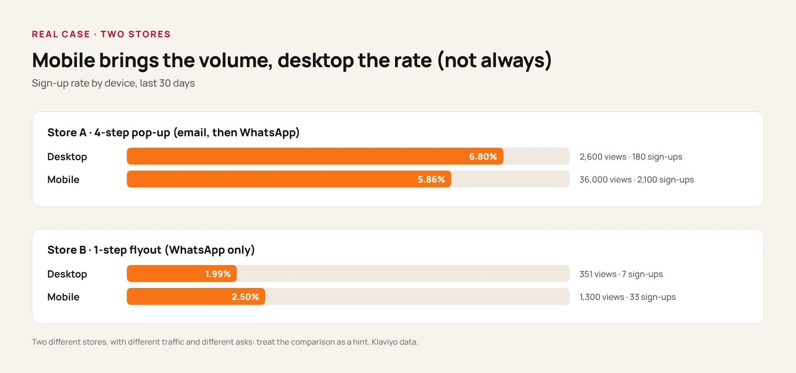
The second store in the chart shows the opposite: there, mobile converts better (2.50% versus 1.99%). No rule works for everyone. That's why it pays to build two versions and look at the data separately. On phones, the store in our case removes the image so the button shows without scrolling. Then short sentences, big buttons, an X that's easy to tap and the right keyboard for email and phone number.
What to offer
The offer has to be concrete and clear in one line: "sign up for our newsletter" isn't a reason. The store in our case promises a gift at the first step and reveals it at the end: €15 off the first purchase, with a code to copy. Alternatives: free shipping on the first order, early access to sales, a useful guide.
Two rules. The code is valid only for the first purchase (we cover this in discounts in abandoned cart emails). And no fake pressure: no countdown that restarts on every visit, no "No, I'd rather pay full price" in place of a simple "No, thanks".
What to ask for, and in what order
First a yes, with no fields
The first step in our case asks for nothing: one question and two buttons. A small commitment makes it easier to type an email right after, and Klaviyo itself suggests this opening step with no fields. 10.80% of the people who see the pop-up click it, and 55% of them also leave their email.
Then the email, then the phone number
The phone number comes after the email, never together with it. Klaviyo notes that forms asking for an email convert better than forms asking for a phone number, and that asking for both at once slows down email list growth. In our case, 63% of the people who leave their email also leave their WhatsApp number.
The second store does the opposite: a flyout that asks right away for WhatsApp consent only, with no email and no explicit gift. Out of 1,673 people who saw it, 42 left their number: 2.51%. On the same basis, the footwear store collects WhatsApp numbers from 1,455 people out of 38,866, about 3.7%. The stores, traffic and offers are different, so take it as a pointer, not proof.
The phone step must be skippable
At the third step there's a "No thanks, I'm not interested" link: people who don't want to share their number still stay subscribed by email.
Consent
For email, collect consent clearly, with a link to your privacy policy. For WhatsApp and SMS you need separate, explicit consent: Meta asks you to state clearly that the person agrees to receive messages from that store, naming it. The text in our case explains that people will get informational and marketing messages, including cart reminders, that consent isn't a condition of purchase and that they can opt out by replying STOP. The full rules are in abandoned cart text messages: SMS and WhatsApp.
How to read the stats of a multi-step pop-up
Each step has two percentages, and they tell you different things.
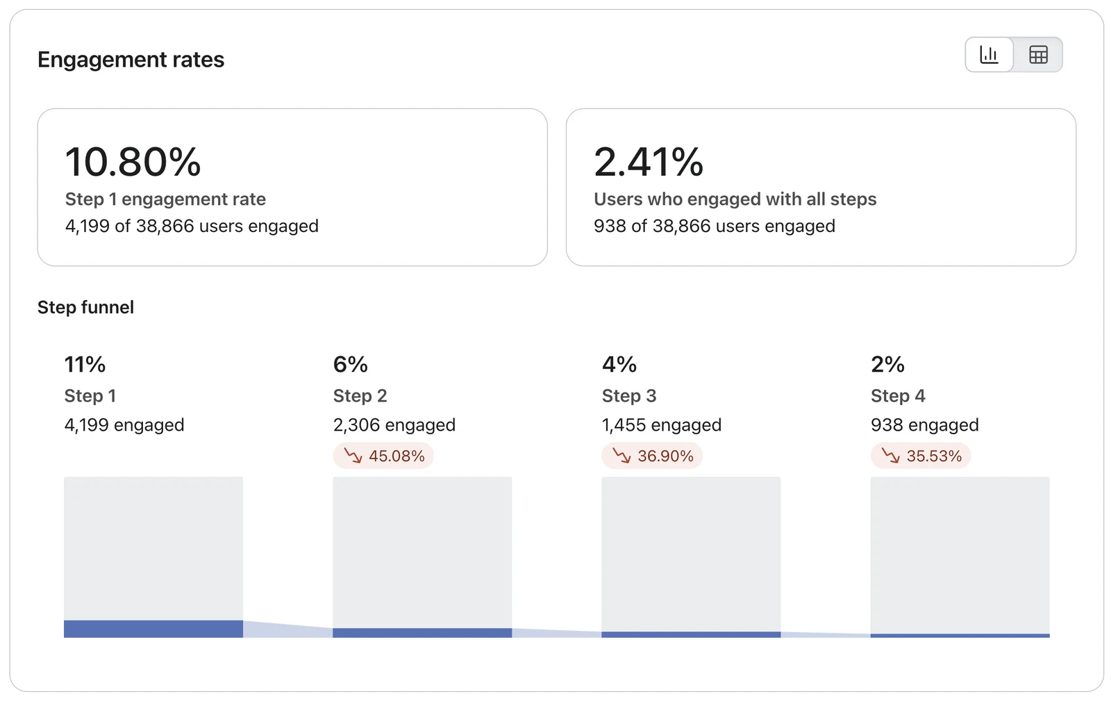
- The rate based on people who saw the form. 10.80% click yes; 2.41% reach the last step. It tells you how the pop-up performs overall.
- The drop-off from the previous step. From yes to email you lose 45.08%, from email to phone number 36.90%, from phone number to the click on the collection 35.53%. It tells you where to act: here the biggest drop is between yes and email, so the first test belongs on the second step.
- The signup rate. In forms that ask for both email and phone, Klaviyo counts the first of the two fields as the signup, so here it's the email: 2,306 signups, 5.93%. Klaviyo suggests aiming for about 3% or more for pop-ups and flyouts. For pop-ups, the dashboard compares it with similar stores over the last three months: this one is labeled "Excellent".
Change one step at a time, or you won't know which change produced the result. And when you compare with periods far apart, remember that since April 1, 2025 Klaviyo filters out bots and crawlers more effectively: fewer views, higher rate.
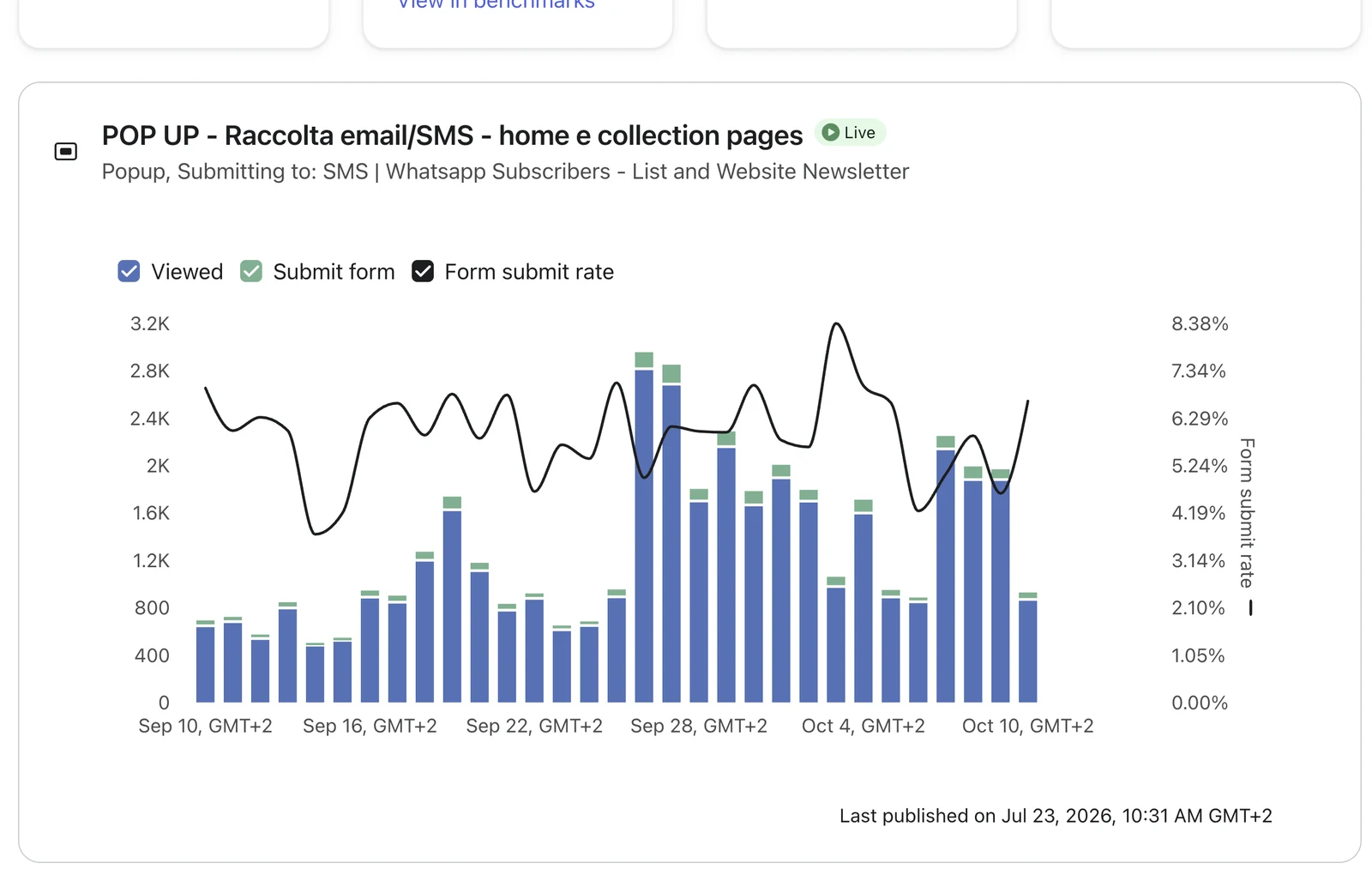
Read the daily trend alongside your active campaigns. In our case, views range from about 500 to about 2,900 a day. During the peaks at the end of September, probably tied to ad campaigns, the rate falls toward 5%; on quiet days it climbs to 8%. Colder traffic signs up less. It's an observation about this store, not a rule, but it keeps you from mistaking a traffic spike for a pop-up that has stopped working.
Why the pop-up matters for cart recovery too
A recovery email only goes out if the store knows who abandoned the cart: people who never left any contact details stay anonymous. The rest of the journey is in the abandoned cart recovery guide. To reach the inbox you need a clean list, as we explain in why your store's emails go to spam.