An effective ecommerce newsletter is built for people who scan it, not for people who read it: a headline that says it all in live text, one primary button per screen and seven blocks in an order that leads from attention to the click. The layout decides how many people reach your site; the topic decides whether they have a reason to go. We'll show it with a made-up store and with the real numbers of an Italian footwear store we work with. This article is about how to lay the newsletter out; what to write in it is covered in ecommerce newsletter ideas.
How do you structure an effective newsletter for an ecommerce store?
Start with how people look at it. In Nielsen Norman Group's tests, 79% of users scanned new pages and only 16% read them word by word. That research dates from 1997, but in 2017 the same institute found the F-shaped reading pattern again, on mobile too: the first lines, and the first words of each line, get almost all the attention.
For a newsletter, that means three things:
- The message goes at the top. After two seconds, people should know what it's about and where to click.
- Each block has one job. If a block does three things, people who scan see none of them.
- Each block starts with the words that matter. "New in: twelve hand-glazed pieces" works; "We're delighted to announce that..." doesn't.

Try AchillesAI for free: it optimizes the copy of your emails continuously and automatically.
Try it for freeVisual hierarchy: size, contrast, density
People who scan don't choose what to read: the layout chooses for them, with three levers.
- Size and weight. A large, bold headline gets read first. If everything is big, nothing is.
- Contrast. Color guides the eye to the button, in dark mode too.
- Density. Small, dense text looks secondary, and only people who are already interested read it. Paragraphs of two or three lines, no walls of text.
One primary button per screen
| Level | What it's for | How many |
|---|---|---|
| Primary | The action the newsletter exists for | One per screen |
| Secondary | The alternative for people the primary doesn't convince | One, with less visual weight |
| Tertiary | Categories, guides, social | More than one is fine, as text links |
| Unsubscribe | Leaving the list | Always visible at the bottom, never hidden |
Two identical buttons on the same screen force people to choose, and people who scan often don't. The button text says what happens next: "See the collection", never "Click here". A hidden unsubscribe link keeps no one: people who can't find it mark the email as spam, and that weighs on every send, as we explain in why emails go to spam.
The anatomy of a newsletter in seven blocks
Take a made-up tableware ceramics store announcing its autumn collection.
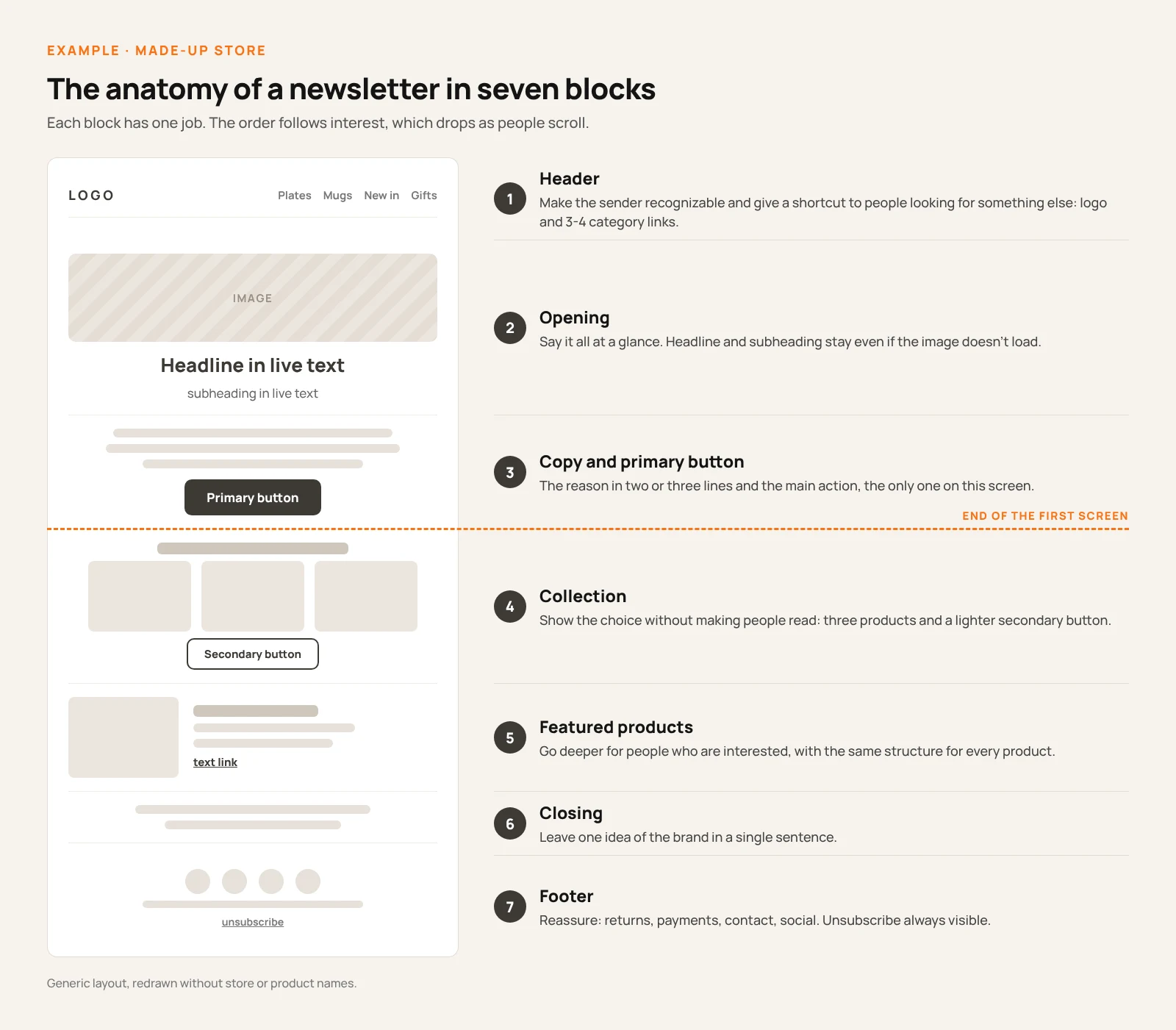
| Block | Job | In the example |
|---|---|---|
| 1. Header | Make the sender recognizable, offer a shortcut | Logo and four links: Plates, Mugs, New in, Gifts |
| 2. Opening | Say it all at a glance | Photo of the table; headline "Autumn has arrived at the table" in live text |
| 3. Copy and primary button | Give the reason and the action | Three lines on the colors of the season; button "See the collection" |
| 4. Collection | Show the choice without making people read | "Three pieces to start with": three photos and the secondary button "All new arrivals" |
| 5. Featured products | Go deeper for people who are interested | Same structure for every piece: name, photo, one sentence, link |
| 6. Closing | Leave one idea of the brand | "No two pieces are alike: that's how we work" |
| 7. Footer | Reassure and offer services | Returns, payments, workshop, social, contact, unsubscribe |
Why this order. Interest drops as people scroll, so whatever leads to the click sits on the first screen. People who keep going find the overview first, then the details, which only interested readers read. The footer answers the doubts that come last: returns, shipping, payments. And the same structure for every product is quicker to scan.
The copy inside the blocks needs a writing framework: we cover that in AIDA, PAS or FAB: which copywriting framework to use in emails.
Copy that holds up without images, in dark mode and with any font
Images may not load. Headline, subheading and button go in live text, not inside the image: if the image is blocked, the message survives. Every image gets alt text.
Dark mode changes colors. According to Litmus's guide, email clients behave in three ways: some change nothing, some invert only light backgrounds, some invert everything. In Litmus data from 2022, an average of 35% of tracked opens happened in dark mode. The precautions: logo as a transparent PNG with a light outline, no thin fonts, and a test in the main clients before important sends.
Your website font doesn't always arrive. According to Klaviyo, custom fonts work in Apple Mail and iOS Mail but not in Gmail (at least the web version) and Yahoo, where the fallback shows up; according to Can I email, Outlook for Windows ignores fonts loaded from an external server. In Litmus data for July 2026, Gmail and desktop Outlook (Windows and Mac) together account for about one open in three (27.03% and 5.83%). Pick a fallback font close to yours.
The case: what a real newsletter tells you
The Italian footwear store we work with sells handmade women's shoes in the premium segment. This is its new collection newsletter from early October 2026.
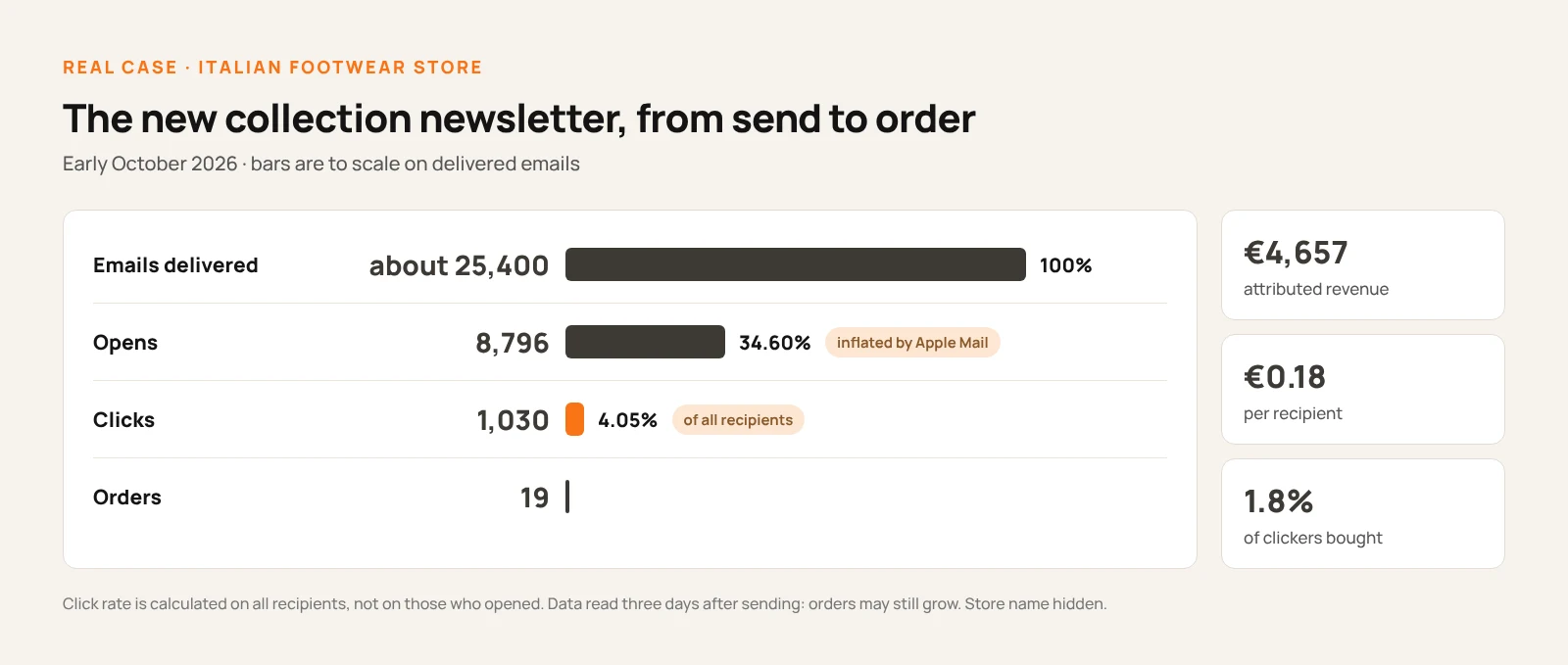
- About 25,400 emails delivered.
- Opens at 34.60%. An inflated number: Apple Mail Privacy Protection records opens nobody made, and Klaviyo says it can't tell them apart from real ones.
- Clicks at 4.05%: 1,030 people. Click rate is calculated on all recipients, not on those who opened. On those recorded as openers it would be about 11.7%.
- 19 orders, €4,657 in attributed revenue, €0.18 per recipient. About 1.8% of the people who clicked bought.
Data read three days after sending: orders and revenue may still grow.
The newsletter's job ends at the click. The 4.05% is above the average of the store's 42 campaigns over the past twelve months (3.56%); the rest is down to the product page, price and timing. To judge the structure, look at clicks; to judge the campaign, look at orders and revenue per recipient.
The topic matters more than the layout
In the same store, in the twelve months to October 10, 2026, four types of newsletter have enough sends for a comparison.
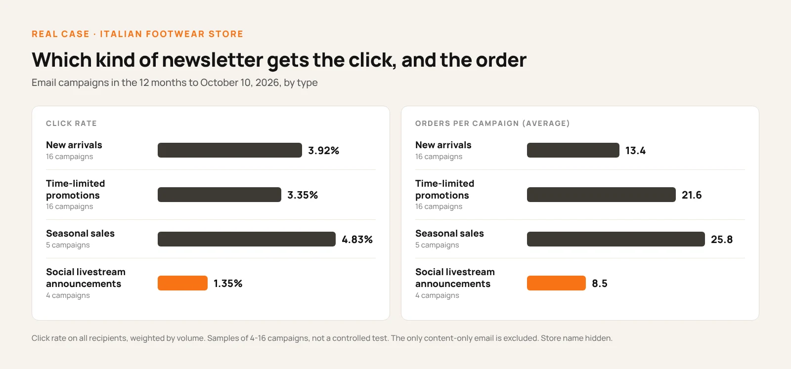
| Type | Campaigns | Click rate | Orders per campaign |
|---|---|---|---|
| New arrivals (collections, new in) | 16 | 3.92% | 13.4 |
| Time-limited promotions | 16 | 3.35% | 21.6 |
| Seasonal sales | 5 | 4.83% | 25.8 |
| Social livestream announcements | 4 | 1.35% | 8.5 |
Social livestream announcements have a click rate of 1.35%, less than half that of the other types. That isn't a layout problem: the action they ask for happens on social media, and the newsletter gives no reason to visit the site. When the topic doesn't lead to the site, no button can save it. And new arrivals get more clicks than promotions but bring fewer orders: people browsing the collection often don't buy right away.
Two caveats: these are 4 to 16 campaigns per type, not a controlled test, and promotions fall on dates like Black Friday. The year's only content-only email is left out: one send isn't enough.
The click map: how to tell if your newsletter gets read to the end
Almost every platform shows where people click inside the email: it's the most direct tool for judging the structure.
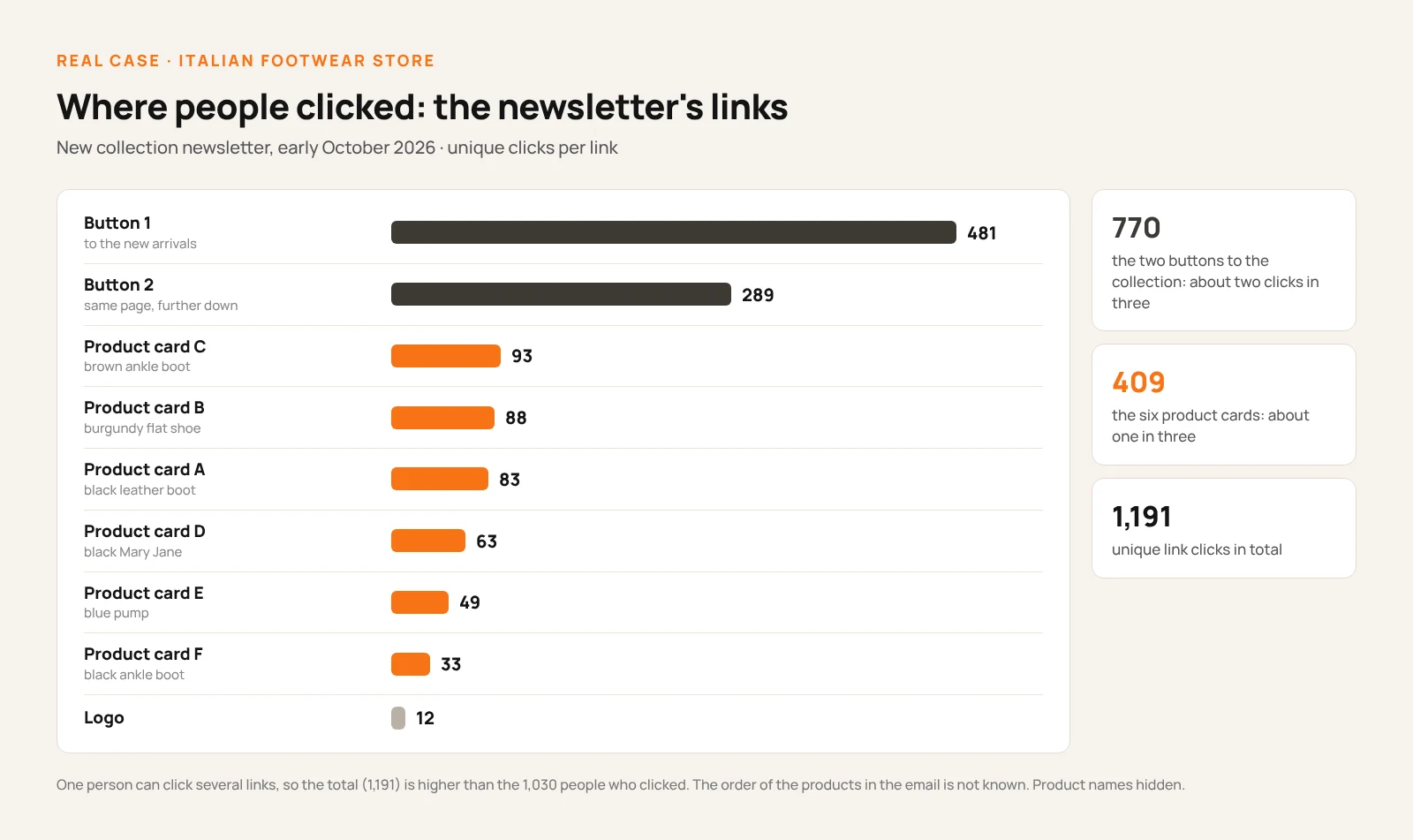
In the early October newsletter, the two buttons to the collection get about two clicks in three: 481 people on the first, 289 on the second, further down. The second button still drawing 289 people tells you the email gets scrolled, not just glanced at the top. The six product cards get fewer clicks than the buttons, 33 to 93 each, but every one of them gets some. We don't know the exact position of each block and there was no test: these numbers describe one send, not a rule.
That's why it pays to compare the maps of several sends with the same structure: one map describes a newsletter; three maps describe your list.
The most common mistakes
- Three identical buttons on the first screen, perhaps saying "Click here".
- A custom font without a chosen fallback. In Gmail on the web, your text changes look.
- Judging the structure by opens. With Apple Mail the number is inflated: look at clicks.
- A hidden unsubscribe link. It turns into a spam complaint.